Contents · Sections
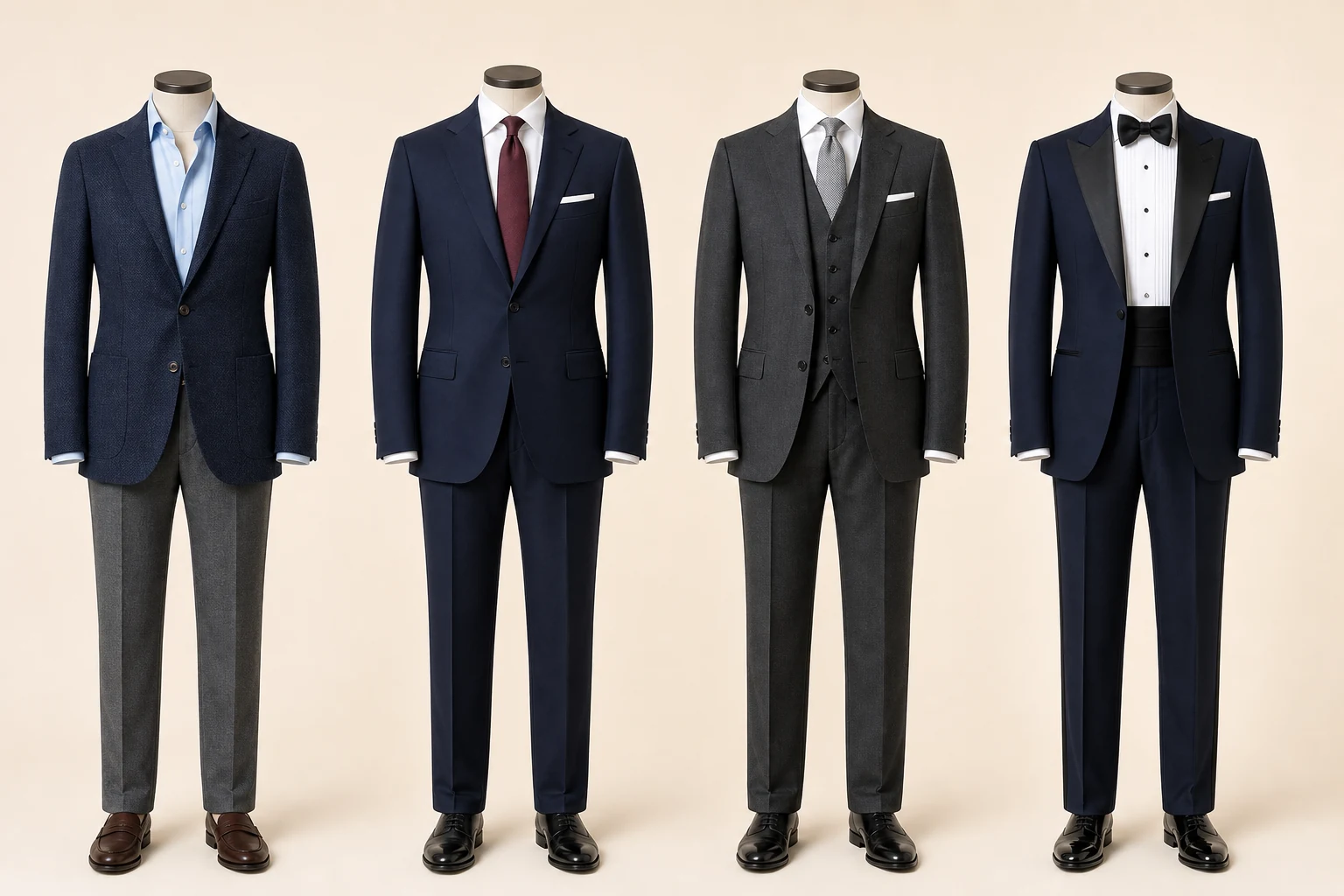
What colour communicates
Context changes meaning, but some visual tendencies are dependable starting points.
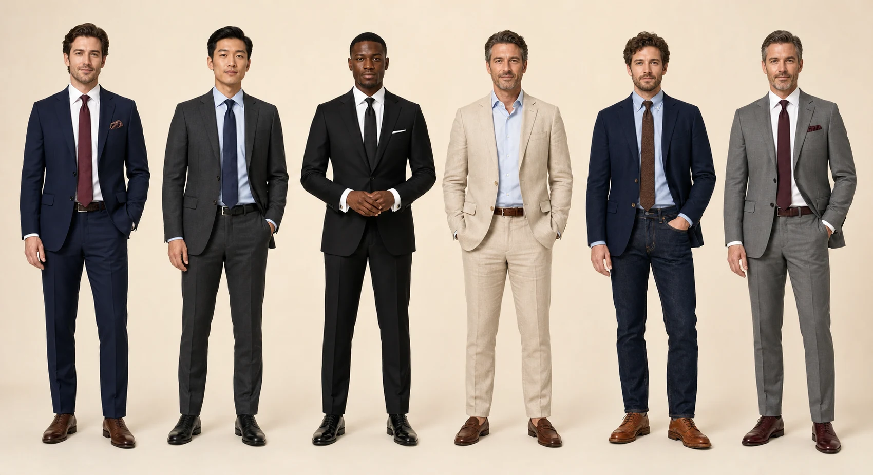
Compare the visible differences in what colour communicates: proportion, material, finish and behaviour in use.
Context changes meaning, but some visual tendencies are dependable starting points.
“Could you show me how the choices in what colour communicates change the result for my use, climate and preferred formality?”
Navy
Trustworthy, adaptable and less severe than black; an excellent base for business wardrobes.
Charcoal
Quiet authority and high versatility, especially with white, pale blue, burgundy and dark footwear.
Black
Sharp and ceremonial in evening contexts, but often harsher than navy or charcoal in daytime business.
Earth and light neutrals
Brown, olive, stone and beige feel approachable and textured, with formality governed by cloth and contrast.
Why combinations work
Balance temperature, value, saturation and texture before adding pattern.
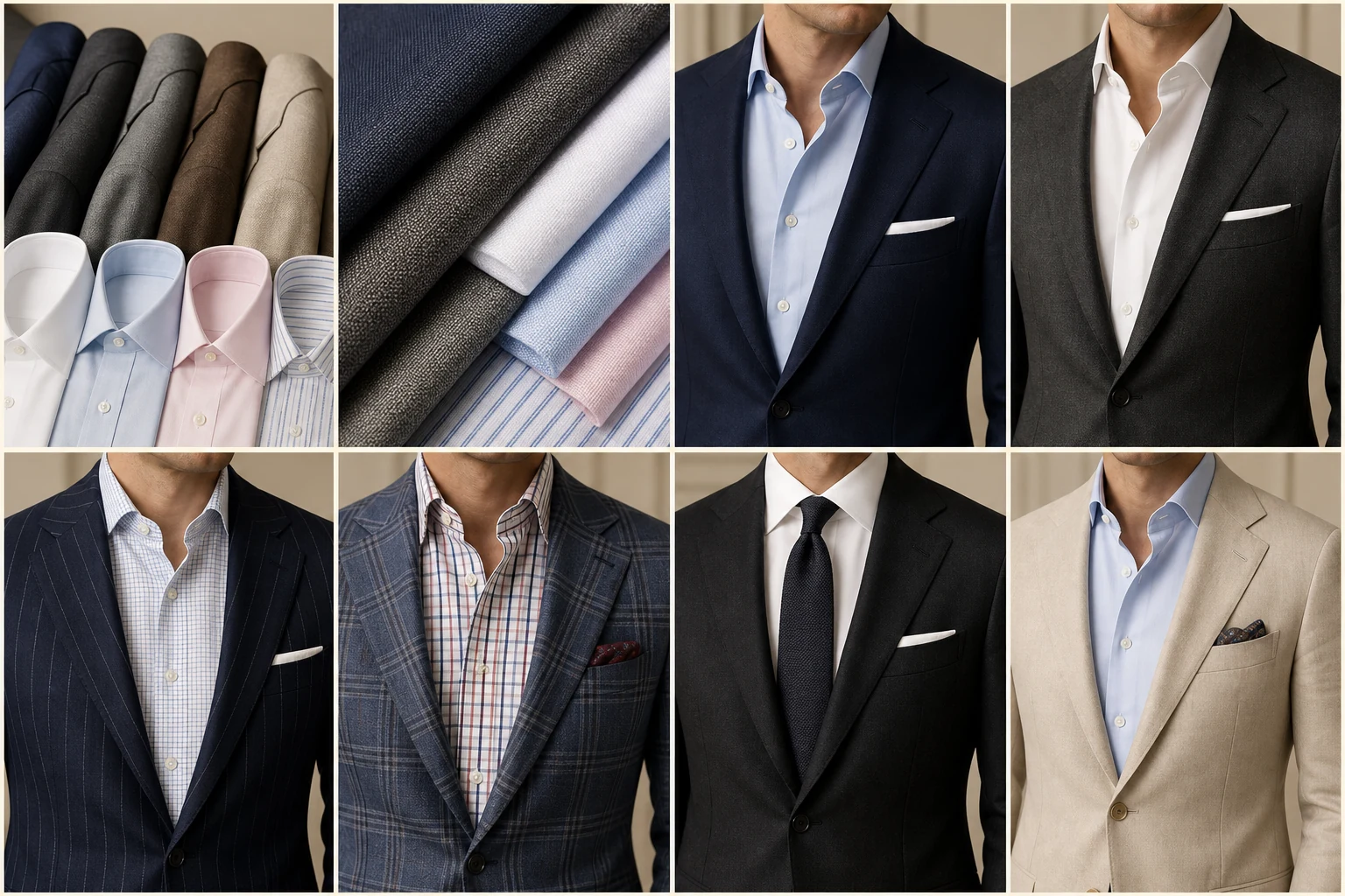
Compare the visible differences in why combinations work: proportion, material, finish and behaviour in use.
Balance temperature, value, saturation and texture before adding pattern.
“Could you show me how the choices in why combinations work change the result for my use, climate and preferred formality?”
Navy + brown
The cool dark suit gains warmth from brown shoes; a pale blue shirt bridges the two without strain.
Charcoal + burgundy
Burgundy adds depth while remaining darker and quieter than a bright red.
Beige + dark brown
Similar warmth creates harmony; a white or blue shirt keeps the face area fresh.
What fails
Competing high-saturation colours, mismatched formality and several loud patterns leave no visual hierarchy.
Suit, shirt and tie
Move from the largest field to the smallest: suit, shirt, then tie.
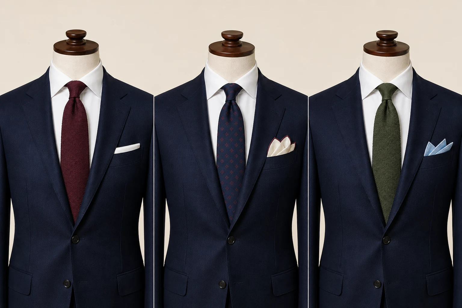
Compare the visible differences in suit, shirt and tie: proportion, material, finish and behaviour in use.
Move from the largest field to the smallest: suit, shirt, then tie.
“Could you show me how the choices in suit, shirt and tie change the result for my use, climate and preferred formality?”
Contrast
Ensure the tie separates clearly from the shirt and remains legible against the jacket.
Pattern scale
Combine different scales—a broad stripe with a small neat pattern—rather than repeating the same rhythm.
Texture
Matte grenadine, wool or knit ties settle into textured tailoring; glossy silk asks for a cleaner, more formal setting.
Shoes, belt and bag
Match their level of formality and general colour family; exact dye matching is neither necessary nor natural.
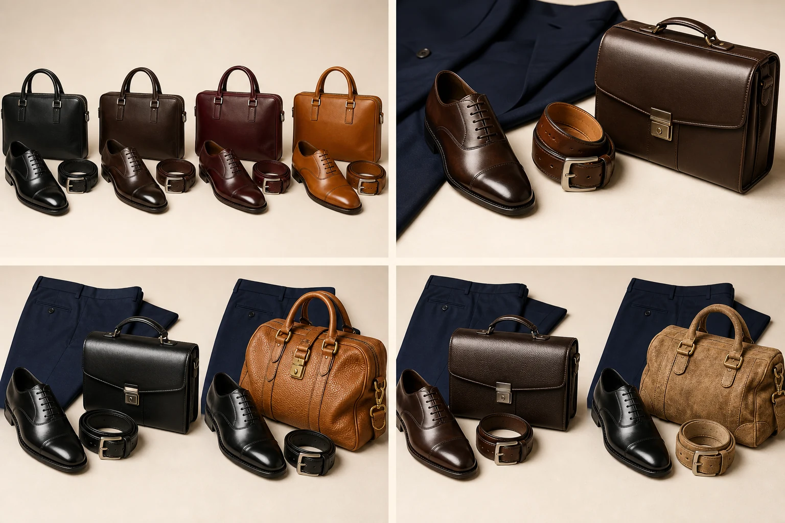
Compare the visible differences in shoes, belt and bag: proportion, material, finish and behaviour in use.
Match their level of formality and general colour family; exact dye matching is neither necessary nor natural.
“Could you show me how the choices in shoes, belt and bag change the result for my use, climate and preferred formality?”
Navy suit
Black is crisp, dark brown is versatile, and oxblood adds controlled richness.
Charcoal suit
Black is the safest formal choice; deep burgundy can work when the setting permits warmth.
Brown or beige trousers
Dark brown, mid-brown, suede and selected loafers can harmonise; keep the belt similarly formal.
Avoid
Black shoes with a casual tan belt, highly polished formal Oxfords with rugged denim, or three unrelated leather colours.
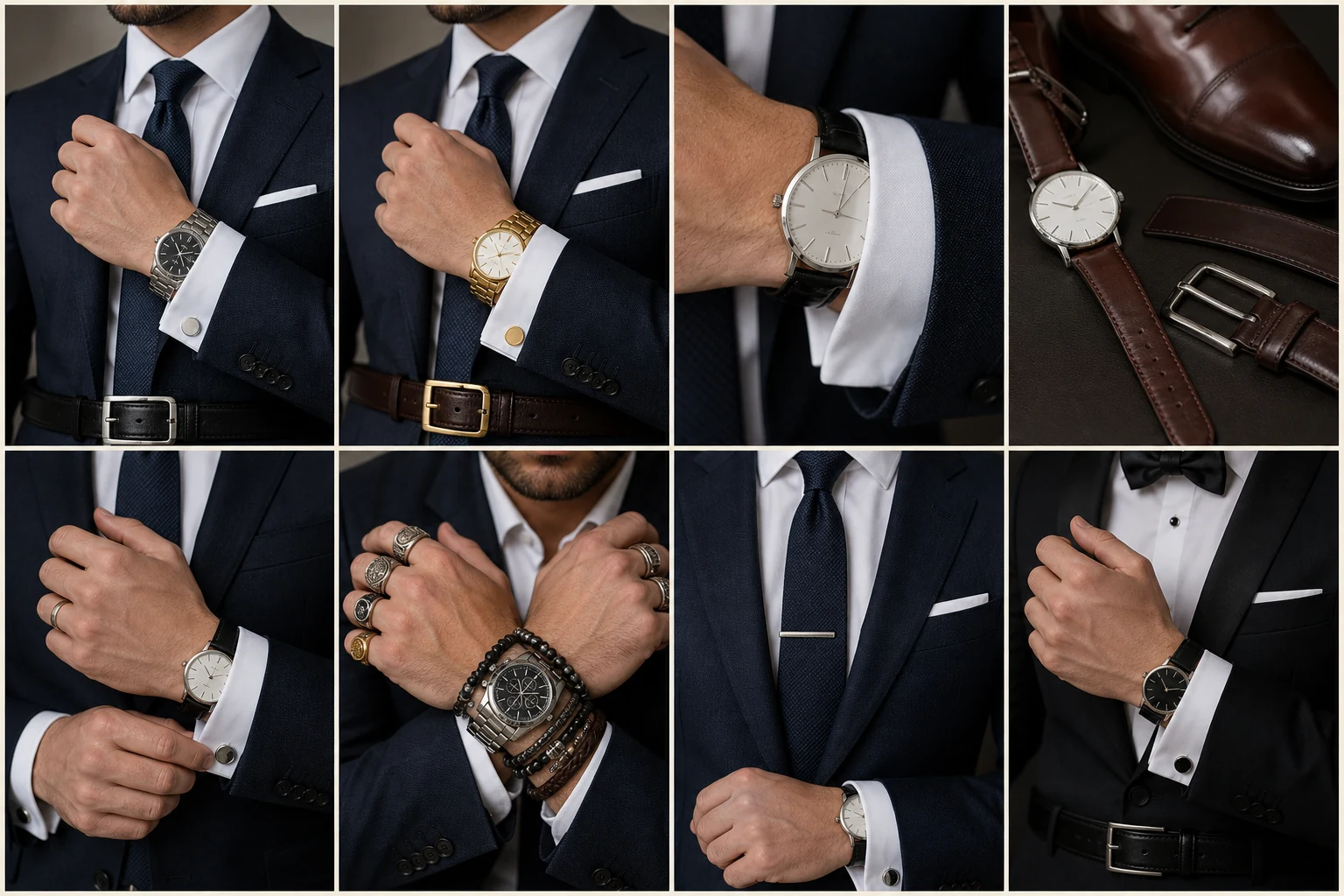
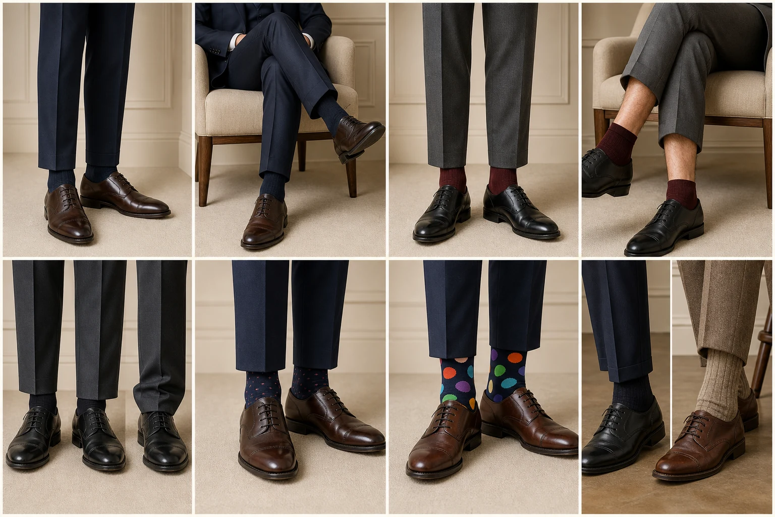
Pocket square, socks, watch and metals
Use small pieces to complete a colour story, not restart it.
Compare the visible differences in pocket square, socks, watch and metals: proportion, material, finish and behaviour in use.
Use small pieces to complete a colour story, not restart it.
“Could you show me how the choices in pocket square, socks, watch and metals change the result for my use, climate and preferred formality?”
Pocket square
Echo a minor colour and vary the material or pattern from the tie.
Socks
Match trousers for continuity, or choose a restrained bridge colour between trouser and shoe.
Watch and metals
Case size and strap formality matter first; keep metal tones broadly coherent.
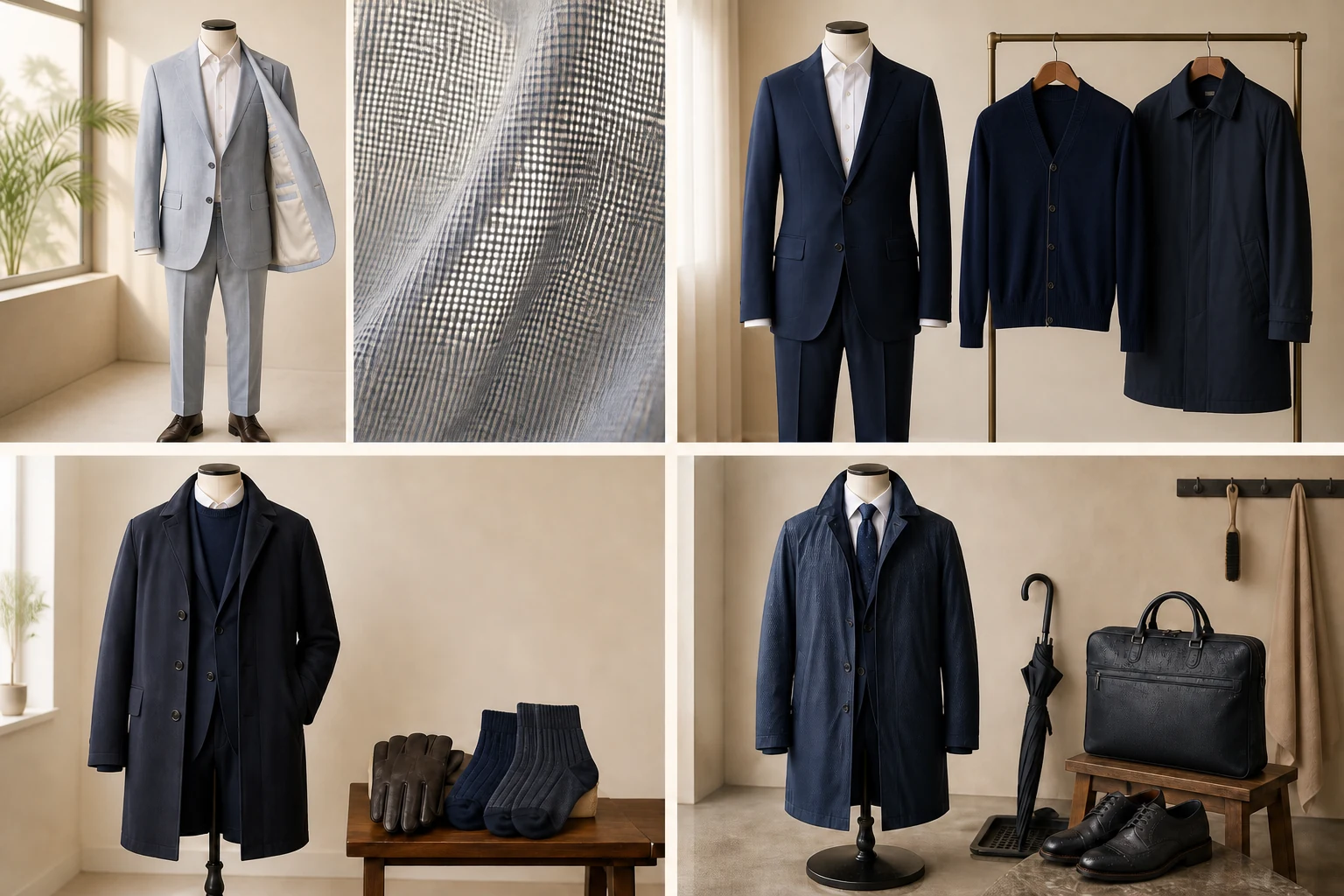
Climate, setting and occasion
A correct combination must also be comfortable and credible in the room.
Compare the visible differences in climate, setting and occasion: proportion, material, finish and behaviour in use.
A correct combination must also be comfortable and credible in the room.
“Could you show me how the choices in climate, setting and occasion change the result for my use, climate and preferred formality?”
Humid heat
Use open weaves, lighter linings, breathable shirts and rotation; overly dark heavy layers can look and feel oppressive.
Cold weather
Flannel, cashmere blends, textured ties and boots support richer colours and layered depth.
Professional settings
Reduce novelty, increase contrast clarity and let fit and cleanliness carry the message.
Formal occasions
Raise surface refinement, simplify colour and follow the event’s dress code before personal flourishes.